Deciding on Which Logo Style to Choose for Your Startup
How to Choose the Right Logo Style for Your Startup?
Your logo is the face of your brand. It will be used across all of your marketing. Choosing the wrong logo, or a poorly designed one, can ruin your brand image. Make sure the logo you choose is the face you want, and one that best represents your brand. Before choosing a logo, you need to clearly define and understand your brand. Once you’ve done that, you’re ready to decide on which logo style fits best with that brand.
What Are Some of the Logo Styles You Can Choose From?
There are many different logo styles and choosing the right one for your business is important. Different brands have different styles, depending on what products and services they offer. A tech company, for instance, will have a different look and feel for their brand and logo than a café or bakery would. Style matters. If your brand is more technical or conservative, then your logo should reflect that. If your brand is more whimsical and fun, then your logo should be too.
Here are some of the main types of logos:

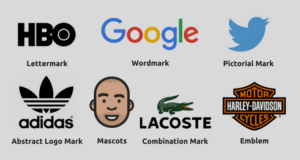
Pictorial Mark and Abstract Mark Logos
A pictorial mark logo is a graphic image or icon. It is a simple image that is instantly recognizable as a brand. There is no better example of this than the Apple logo. This type of logo is used for well-established brands.
An abstract mark logo is similar, but uses an abstract image or form instead of a realistic or identifiable image. Think Nike swoosh. This type of logo gives you the freedom to be creative in expressing your brand, and what it stands for, through shapes and colors, in one simple image. It allows you to create a very unique logo that represents your brand.
Mascot Logos
Mascot logos use a recognizable character or personality to represent your brand. These logos are used to create colorful characters that will act as a representative or spokesperson for your brand. Like what mascots do for sports teams. Some examples of this type of logo are the Michelin Man and Mr. Clean. This type of logo lends itself well to brands that are trying to appeal to children and families.
Emblem Logos
Emblem logos use text, usually the brand name, within a symbol or icon. They have a very classic, traditional look, like a crest or a badge. A good example of this type of logo is Starbucks or the NFL. These logos are often used by car companies, and big organizations. Because of its detailed nature, this type of logo is not suitable for everyone. Printing a very detailed logo on a business card, for instance, might not look very good.
Lettermark and Wordmark Logos
Lettermark logos consist of letters that are usually the brand’s initials. Think of IBM or NASA. This type of logo is simple and effective. Choosing the right font is key when your logo is mainly letters.
Wordmark logos are similar, but instead of initials, this logo uses the full name. It works best for brands with short, clear, and concise names, like Google and Coca-Cola. Again, the font is the key feature here and getting it right for brand recognition is essential.
Combination Mark Logos
Combination mark logos often combine one or more of the other logo styles together. The text and images are either overlayed, side-by-side, or merged to create an image. Good examples of this are Dunkin’ Donuts and Burger King.
The Right Logo for Your Startup
Choosing the right logo for your startup goes hand-in-hand with your branding. The logo style needs to match your brand. Trust Marketing Websites to help you make the right decision. Your brand image depends on it.
